Mack O'reilly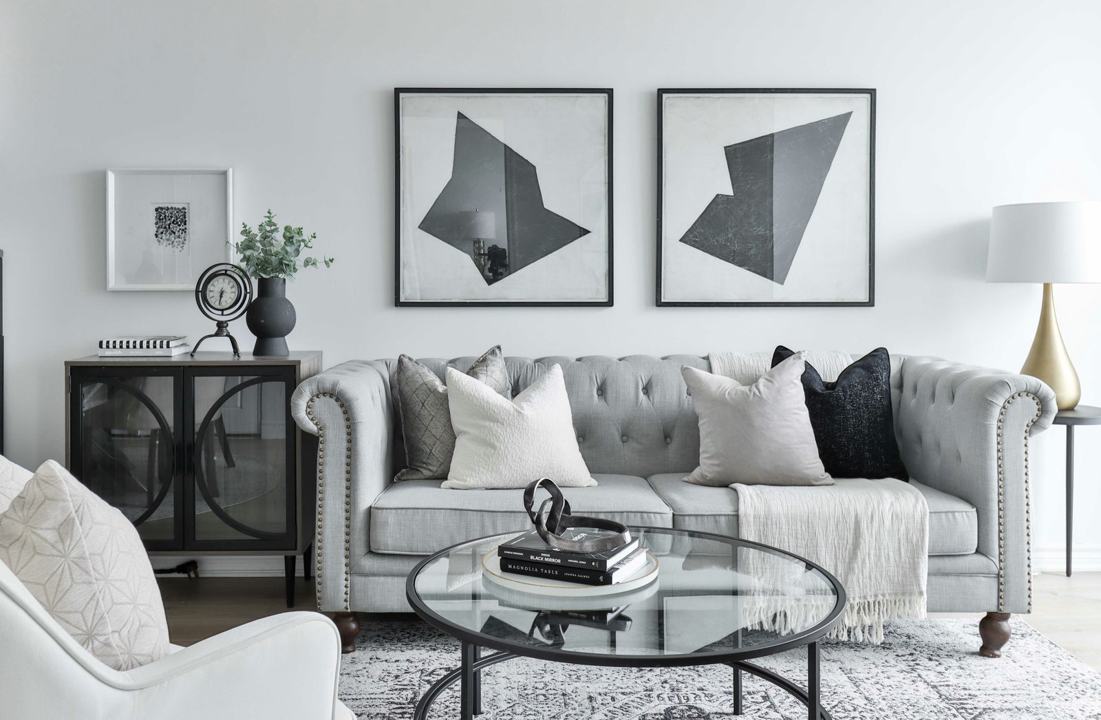
Wall art gives a living room its identity. Furniture establishes comfort and function, but wall art introduces color, personality, and a clear focal point. It can also correct awkward proportions by making a narrow wall appear wider, connecting separate pieces of furniture, or drawing attention toward the room’s best feature.
The strongest arrangements are designed in relation to the furniture below them. A gallery wall art should feel connected to the sofa, while oversized artwork needs enough breathing room to make an impact. These three approaches show how the same basic idea can produce completely different interiors.
Colorful Maximalist Gallery Wall Art
This living room treats the entire wall as one creative composition. Paintings, illustrations, photography, typography, and plants are layered together without following a rigid grid.
Although the arrangement appears spontaneous, several details keep it cohesive. Bright pink, orange, turquoise, and green repeat across the artwork, flowers, textiles, and furniture. Black and white pieces provide visual pauses between the stronger colors, while the dark blue sofa grounds the composition.
The different frame sizes also create movement. Larger paintings establish anchor points, and smaller pieces fill the spaces between them.
How to Recreate It
Begin with the largest three or four pieces. Position them across the wall rather than placing every large frame in one area. Fill the remaining spaces gradually with smaller artwork.
Repeat a few colors throughout the display, but avoid forcing every piece to match. A gallery wall feels personal when the artwork has variety and a clear connection to the people living in the home.
Suitable items include:
- Original artwork
- Family photography
- Vintage prints
- Postcards
- Textile pieces
- Typography
- Children’s artwork
- Small mirrors
- Framed book pages
- Travel souvenirs
Leave a small amount of consistent space between neighboring pieces. The outer edge can remain irregular, but the internal spacing should look deliberate.
Balanced Photo and Clock Display Wall Art
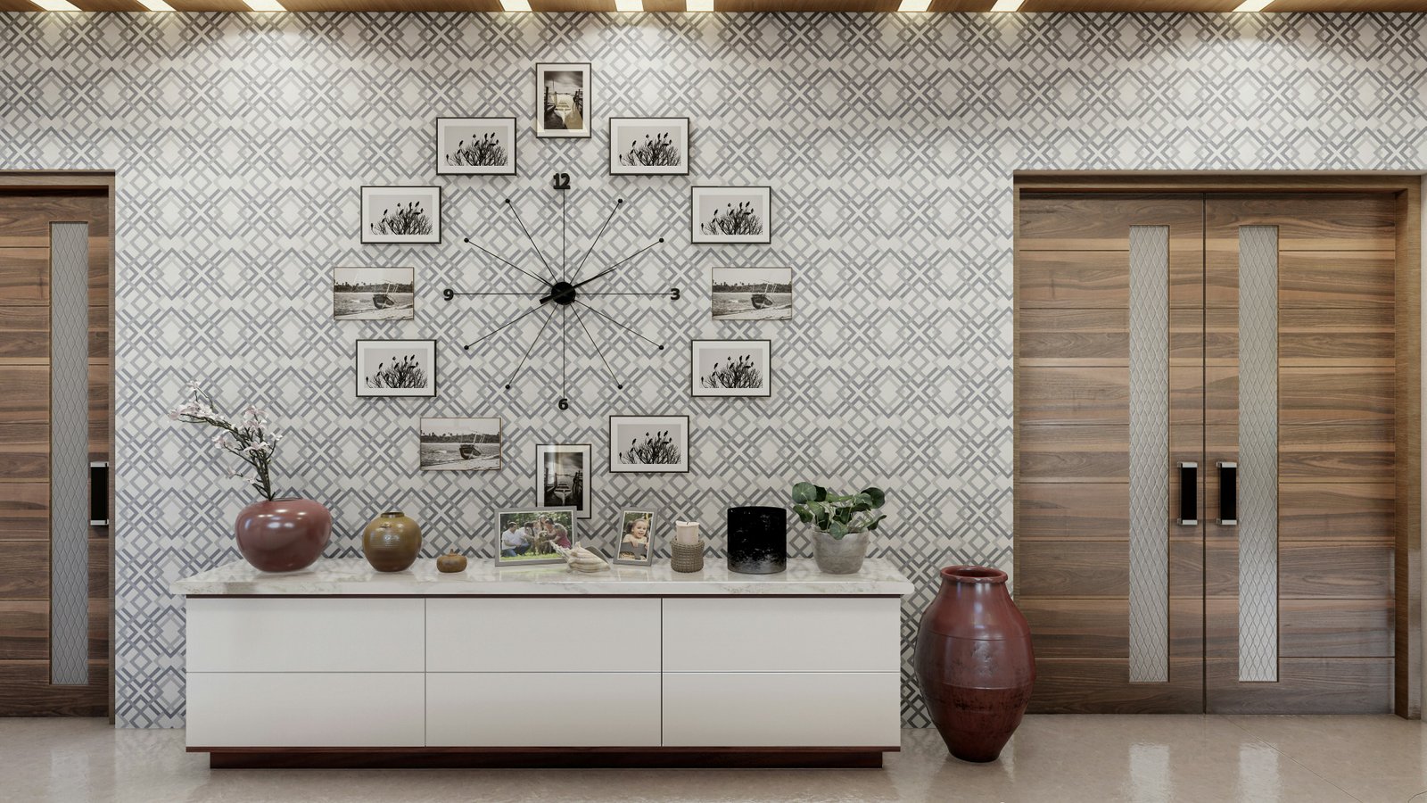
This display uses symmetry instead of free-form layering. A large clock forms the center, and framed photographs follow its circular outline. The console table below gives the arrangement a clear foundation.
This format works well on wide walls, in entry-facing living room areas, or above low storage furniture. It can also turn family photographs into a designed feature without making the wall feel overly casual.
The patterned wallpaper adds another visual layer, so the frames remain mostly black, white, and neutral. A limited palette helps the arrangement remain visible against the detailed background.
How to Recreate It
Choose a central object first. This might be a clock, mirror, painting, textile, or sculptural wall feature. Arrange smaller frames around it using a clear shape such as a circle, rectangle, or oval.
Lay the complete arrangement on the floor before installing it. Measure the overall width and use paper templates on the wall to check the spacing.
Keep the frames related through one repeated feature:
- The same frame color
- Matching white mats
- Black-and-white photography
- Similar image subjects
- A consistent finish
Perfect symmetry is not essential, but both sides should carry similar visual weight.
Oversized Modern Artwork
A pair of oversized artworks creates a quieter and more architectural result. The large scale fills the wall without the visual activity of a gallery arrangement.
In this room, the artwork relates directly to the black-framed cabinet and glass coffee table. The gray abstract forms repeat the sofa’s neutral palette, while the white background prevents the pieces from making the wall feel heavy.
This is an effective option for contemporary, minimalist, transitional, and luxury living rooms.
How to Recreate It
Choose two pieces with the same dimensions and framing. The images can match closely or simply share a color palette, medium, or subject.
Treat the pair as one composition. The total arrangement should be substantial enough to relate to the sofa below it. As a general design starting point, artwork above a sofa often looks balanced when the complete grouping is approximately two-thirds of the sofa’s width.
Keep the gap between the two frames relatively narrow so they read as a pair rather than separate objects.
Choose Art for the Room’s Mood
Artwork should reinforce the atmosphere you want the living room to create.
Calm and Relaxed
Choose landscapes, botanical subjects, soft abstracts, and muted colors. Natural wood frames and wide white mats keep the display light.
Modern and Refined
Use large abstract pieces, geometric designs, monochrome photography, and slim black frames. Fewer pieces at a larger scale generally create a stronger modern effect.
Warm and Traditional
Consider oil-style landscapes, portraits, architectural drawings, and vintage-inspired frames. Dark wood and aged metallic finishes provide warmth.
Creative and Eclectic
Combine different mediums, frame styles, colors, and subjects. Maintain cohesion by repeating several colors or arranging everything inside a defined wall area.
Personal and Collected
Display family photographs, travel prints, meaningful illustrations, and artwork created over time. Avoid buying unrelated pieces simply to fill every empty space.
Match the Artwork to the Furniture
Wall art should form a visual relationship with the furniture below it.
Above a sofa, center the artwork over the seating rather than automatically centering it on the entire wall. Above a console, the arrangement can align with the furniture’s width or extend slightly beyond it when the design is visually balanced.
If the furniture is already colorful or patterned, quieter artwork may provide balance. A neutral sofa can support stronger colors and a more active composition.
Also consider the visual weight of the frames. Thick dark frames create stronger boundaries, while pale wood or frameless canvases feel lighter.
Hang Artwork at the Right Height
Artwork is often hung too high, leaving an awkward gap between it and the furniture. The display should feel connected to the room rather than floating near the ceiling.
When artwork hangs above a sofa or console, begin with a moderate space between the furniture and the bottom of the display. Adjust for tall back cushions, lamps, plants, and other objects that share the wall.
For an empty wall, use the center of the artwork or grouping as the main reference rather than aligning its top edge with doors or windows.
Before drilling, attach paper templates to the wall and view them from the primary seating position.
Build a Gallery Wall That Feels Intentional
A successful gallery wall needs at least one organizing principle. Without it, even attractive artwork can look disconnected.
Choose one of these structures:
- Grid: Equal frames arranged in straight rows
- Salon style: Mixed sizes placed closely together
- Linear: Artwork aligned along one horizontal line
- Organic: An irregular layout with balanced visual weight
- Central anchor: Small pieces arranged around one large item
- Picture ledge: Layered frames resting on one or more shelves
A grid feels formal and clean. An organic arrangement feels collected and personal. A picture ledge offers flexibility because artwork can be rearranged without creating new holes.
Coordinate Frames Without Matching Everything
Frames should support the artwork and the surrounding room. They do not all need to be identical.
A mixed gallery wall can use black, white, wood, and metallic frames if the finishes repeat across the arrangement. Avoid introducing a new frame style for every piece.
For a cleaner display, use identical frames with matching mats. This is particularly effective for family photographs, architectural prints, or a coordinated series.
The mat also influences the final appearance. Wide white mats make small artwork feel more important and give a busy wall additional breathing room.
Use Wall Color as Part of the Display
The wall itself acts as the background of the composition.
White and pale walls provide strong contrast for colorful artwork. Dark walls can make pale frames, metallic finishes, and saturated paintings feel dramatic. Patterned wallpaper requires a more controlled art palette so the display remains readable.
If you are planning both paint and artwork, choose them together. Pulling one secondary color from the artwork into the wall can create a sophisticated, connected result.
Wall Art Ideas for Renters
Creating an expressive wall does not always require permanent installation.
Renter-friendly options include:
- Picture ledges installed with approved hardware
- Lightweight prints with removable hanging strips
- Art displayed on a console
- A large framed piece leaning against the wall
- Decorative folding screens
- Framed wallpaper panels
- Freestanding shelving with displayed artwork
Always check the weight limits and surface instructions for removable products. Large mirrors, glass frames, and heavy artwork require secure support.
Common Wall Art Mistakes
Choosing Art That Is Too Small
One small frame above a wide sofa can look disconnected. Use a larger piece or combine several smaller works into one complete grouping.
Hanging Everything Too Far Apart
Large gaps prevent a gallery wall from reading as one composition. Keep related pieces visually connected.
Matching Every Color Exactly
Artwork can relate to the room without repeating every furniture color. A few shared tones are enough.
Ignoring the Viewing Distance
Small, detailed artwork may disappear across a large living room. Reserve intricate pieces for walls that can be viewed more closely.
Filling Every Wall
A strong focal wall needs quieter areas around it. Leaving some walls open prevents the room from becoming visually exhausting.
Installing Before Testing the Layout
Paper templates reveal scale and spacing problems before holes are made. View the planned arrangement from several positions in the room.
Final Thoughts
The best livingroom wall art ideas begin with the type of atmosphere you want to create. A colorful gallery wall feels expressive and personal, a symmetrical display creates order, and oversized artwork gives the room a clean architectural quality.
Choose a layout that fits the scale of the wall, relate it to the furniture below, and repeat enough colors or frame finishes to establish cohesion. The artwork should feel collected for the room—not added simply because the wall was empty.